

Leading lines 1-

Leading Lines 2-

Fill the frame 1-

Fill the frame 2-

Simplify 1-
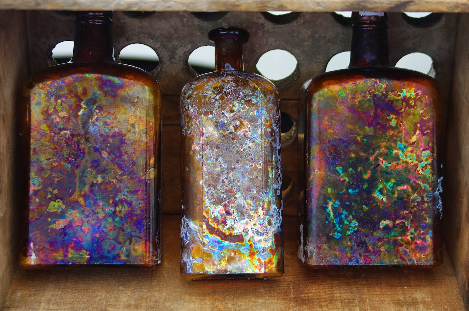
Simplify 2-

Reflection- My favorite photos are the simplify 1, because the colors come out really well, it is almost an imperfect/ perfect color. The leading lines 2 is my second favorite because it gives the awkward angle a purpose and also with the library and clock tower in the background gives it a new perspective. My third favorite photo is texture 1 because it is such a simple photo but really detailed shot.
John, thank you for submitting this assignment in on time with a great set of photos. There are a couple corrections you should make, and being that this was in on-time, you have the chance for full credit. Email me when this is done " mslaophoto@gmail.com ".
ReplyDeleteTexture 1 is really nice and it is mainly due to the side lighting, it really enhances the texture. Good job.
Leading lines 1 - not really sure whether the lines "lead" my eye toward a focal point, but I like how the scene is broken up.
Leading lines 2 - is really cool. I like the angled pole, it adds weight and "movement".
John, I really like your "fill the frame" photos in general (don't get rid of them by any means!) but you should redo these two. If you search online or look at the powerpoint presented in class, fill the frame is about getting up close to the subject and not necessarily showing the entire scene but just a part of something. It's less literal and allows the viewer to focus in on what's there and sometimes it is what isn't in the frame that perks our interest. Also, the "simplify" images are amazing - i personally love them! I love the texture and grittiness of the bottles. However, "simplify" is more about "minimalism" and not having many distractions in the frame... it's the idea that less is more. Probably a challenge to limit yourself, but try it out and let me know when you get it done. Thanks John!